Happy Monkey Miami
MY ROLE: UX/UI Designer DURATION: Two Weeks PLATFORM: IOS App
-
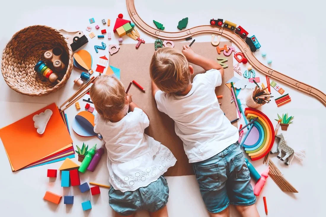
Happy Monkey Miami is a small business in Miami, FL, offering ethically made toys from around the world. Their brand statement, ‘Conscious Toys for Conscious Kids®’, highlights their focus on sustainability. However, their website feels chaotic and doesn’t reflect their values. This project focused on redesigning the site to create a more user-friendly and organized experience for parents.
-
I led the project in a team of three UX designers, where I focused on the website's development and user testing. During ideation, I collaborated with my team on user research and competitive market analysis.
-
The existing interface limited user flexibility and lacked clear organization, making navigation and tasks difficult. This led to user frustration and emphasized the need for greater user freedom.
-
Providing users with greater control and flexibility while improving the organization of content. The aim was to create a more intuitive and structured interface that supports a seamless and user-friendly experience.
Redesigning website to increase user freedom by 75%
UX Audit
I started by reviewing the website's design, noting its style, format, and interface. After completing individual heuristic evaluations, the team met to share our findings. We agreed that the main issues were readability and navigation.
User Survey
To better understand the market, we created a survey with questions focused on shopping for children. We distributed it through our connections and social media platforms. The results showed that price and toy type were key factors in purchasing decisions. Interestingly, the survey revealed that people prefer shopping in person over online when buying gifts for children.


Interviews
We conducted seven interviews with individuals who purchase products for children, including both parents and those with family members who recently had children. The findings revealed that most participants found the website's organization confusing or overwhelming.
Price was a key factor in shopping decisions, with most interviewees having a median budget of $50 per gift/item. Users expressed a preference for items to be categorized by age, type, and price. A "Gift Ideas" section was also a popular request. Many participants wanted more information about the physical store, and the majority cared about the values of the company or store owner.
Click to ViewAffinity Diagram & Empathy Map
We created an affinity diagram with the insights we collected. We then voted to identify the most important insights which were the following:

Difficulties
The main page has a lot of elements and it’s overbearing.
No information on the physical location
A lack of order makes it difficult to navigate

Features
Redesign the website to be cleaner and simpler to use
Filter options
Provide a Collection section based on brand and type.
Display store location and hours.
Disorganized Content
It isn’t easy to locate products, through the search option some products show up in the results while others don’t.
No Store Details
Many people do not know that there is a physical store to visit in Miami. The stakeholder is a supporter of businesses owned by mothers, and POC (people of color), like herself but there is no section on the website sharing the store’s brand morals.
Emotional Journey Map
User Persona

Click To View

Based on the information we've gathered, we created a User Persona that represents the target market for ‘Happy Monkey’. Rachel is a 36-year-old health-conscious interior designer and mother of two young children. Her top priority is raising her children, and she values providing them with educational toys that are ethically sourced and support their development.
Rachel needs…
A website that aligns with her values.
Quick and easy access to products she believes in.
Products that are easy to find and have convenient home shipping options.
Creating a user persona helps us better understand and empathize with the user for whom we're designing a solution.
User Journey:
StoryBoard
Now that we’ve identified our main demographic, it’s time to assess their experience with the current ‘Happy Monkey’ website. Let’s follow the journey of Rachel, a busy mother of two, as she searches for a gift for her son’s birthday.
Click To View

Journey Map
Ideation

Userflow
After exploring the user’s pains, gains, emotional journey, and storyboard. It brought up a lot of pains but it came to one main problem: how to help the user navigate the website to locate certain products.
HMW- highlighted the solutions in how we may help the user.
Sectioning by age, season, price, and brands
Keep our users informed on discounts, promos, and seasonal items
Create a collections section i.e. Winter Collection, Safari Collection, Ocean Collection (mix of brands with the same theme)

Click To View

Click To View
Site Map
Click To View
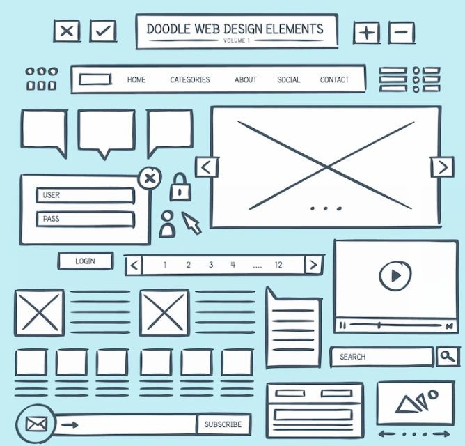
Click to ViewLo-Fi

A lo-fi wireframe is a simple, basic sketch of a website's layout, like a blueprint. For the "Happy Monkey" site, it would show where things like product categories, the search bar, and the cart go, but without colors or images, just focusing on structure and flow.
Mid-Fi
Mid-fi wireframes are more detailed than lo-fi wireframes but still simple. For "Happy Monkey," a mid-fi wireframe would show where things like product categories, the search bar, and the cart go, with clearer placement and some basic features, like buttons. It's a better idea of how the site will work before adding colors or images.
Prototype
Jakobs’s usability heuristics
User Control and Freedom—We wanted to give users control by organizing the products clearly and sorting them by age, type, and price.
Flexibility and efficiency- giving the user different pathways to a product.
By providing these freedoms to the user we had a 75% success rate when navigating the site.

Next Steps
We need to make the buttons responsive by adding hover effects.
Discuss with stakeholders to select a better font style and color palette to improve readability.
We need to take additional research from competitors and consumers.
Highlight to stakeholders the importance of an ‘About Me’ section that showcases their values, such as supporting women-owned and POC-owned businesses.
Conclusion
No matter your lifestyle or income, most people set a budget for non-essentials like toys but are often willing to spend more on clothing. Users tend to take things at face value, so it’s crucial to provide clear information from the start. Include a brand statement, store locations, and operating hours prominently in the header on every page. Additionally, a section on the homepage should highlight the store’s values. In today’s world, where users interact with multiple interfaces from various companies, offering simple and intuitive navigation is key to enhancing the shopping experience.